LinkedIn Carousel Size in 2026: Dimensions, File Limits and Slide Templates
The LinkedIn carousel specs that matter (1080×1350 or 1080×1080 px, 100 MB, 300 pages, PDF), which ratio to pick, mobile-safe margins and font sizes, and three slide structures you can copy.

Getting the size of a LinkedIn carousel wrong doesn't always break the upload. It just makes the carousel smaller, harder to read on a phone, and easier to scroll past.
This guide gives you the verified specs, separates LinkedIn's hard rules from design conventions, helps you choose between portrait and square, and adds what most spec sheets leave out: safe margins, minimum font sizes for mobile, export settings, and three slide structures you can copy. At the end we cover how CrossLike helps a well-built carousel get the early saves it deserves.
LinkedIn carousel size: the quick answer
Design your slides at 1080 × 1350 px (portrait, 4:5) or 1080 × 1080 px (square, 1:1) and upload them as one PDF.
| Setting | Value | Type |
|---|---|---|
| Portrait size | 1080 × 1350 px (4:5) | Design convention |
| Square size | 1080 × 1080 px (1:1) | Design convention |
| File format | PDF recommended; PPT, PPTX, DOC, DOCX accepted | LinkedIn rule |
| Max file size | 100 MB | LinkedIn rule |
| Max length | 300 pages | LinkedIn rule |
| Minimum slides | None stated | LinkedIn rule |
| Documents per post | 1 | LinkedIn rule |
| Page sizes | All pages the same size | LinkedIn rule |
Rules vs conventions: LinkedIn's help pages set the file type, size, page count and one-document limit. The pixel sizes are what design tools and creators have settled on. Break a rule and the upload fails. Ignore a convention and the carousel just looks less polished.
Portrait vs square: which ratio to choose
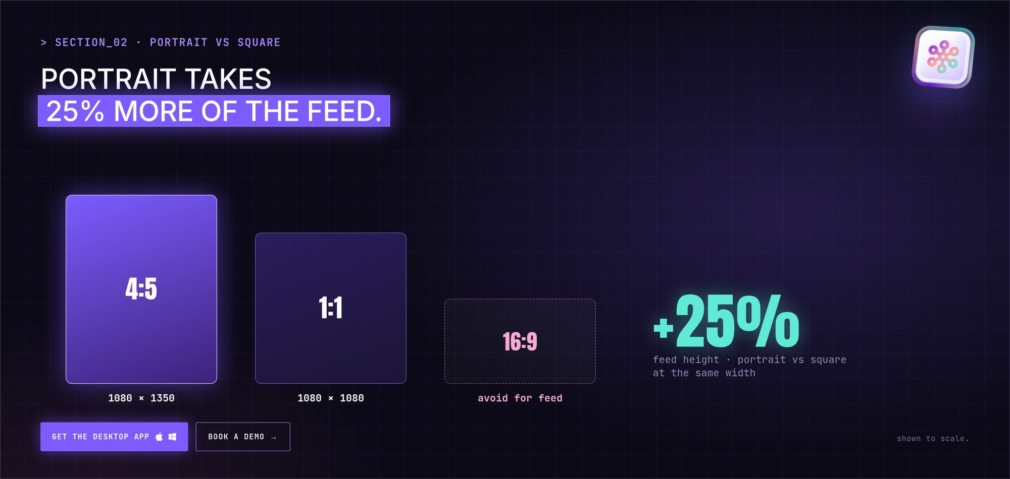
Choose portrait (4:5) when you want the most space in the feed. At the same width, a portrait slide is 25% taller than a square one, so it takes up more of the screen as people scroll.
Choose square (1:1) when you plan to reuse slides as standalone image posts or in other channels, where square crops cleanly.
Avoid landscape (16:9) for feed carousels. A 1920 × 1080 deck will upload, but it's shown much smaller on mobile, where most people read.
Mobile-safe design specs
Most people will see your carousel on a phone, where each slide is shown much smaller than on your design canvas. These practical guidelines keep slides readable (they're conventions, not LinkedIn rules):
- Margins: keep at least 80–100 px of empty space on every edge of a 1080 px-wide slide.
- Headline size: around 64–96 px for the main line on each slide.
- Body text: don't go below roughly 32–36 px.
- Words per slide: aim for 25–40. If you need more, split the slide.
- Contrast: dark text on light, or light on dark. Avoid mid-tones on mid-tones.
- Slide numbers: a small "3/8" in a corner tells people how far they are and nudges them to finish.
The phone test: export, send the PDF to your phone, and read it at arm's length. If you squint on any slide, the text is too small.
How many slides?
Plan 6–10 slides. LinkedIn has no minimum (only the 300-page maximum), so this is a content convention:
- Under 4 slides leaves no room for a hook, a promise, proof and a CTA.
- Over 10 slides raises the chance people stop swiping before your CTA.
The 4 slide roles every carousel needs
- Hook slide: stops the scroll with a question, a number or a bold claim.
- Promise slide: tells readers what they'll get by swiping.
- Proof slides (3–5): one idea per slide, with evidence.
- CTA slide: names one specific next action.
3 slide structures you can copy
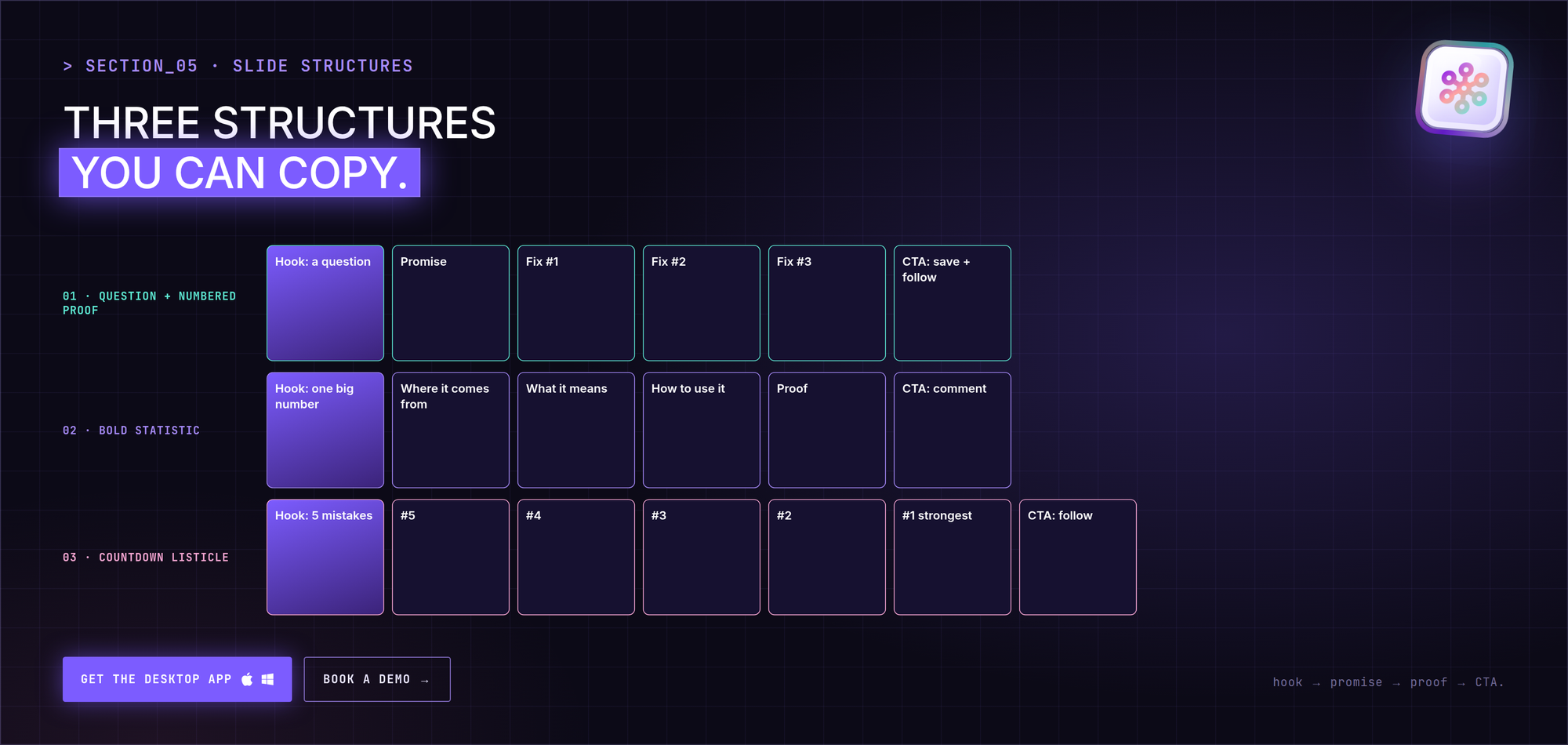
These examples are illustrative, with fictional people, so you can see how each structure fits together.
Pattern 1: Question hook + numbered proof
Example: Lena Ortiz, Head of Demand Gen at a fictional analytics startup.
- Slide 1: "Why do your webinars get 400 sign-ups and 40 attendees?"
- Slide 2: "3 fixes that doubled our show-up rate."
- Slides 3–5: one fix per slide, numbered.
- Slide 6: "Save this for your next event. Follow for more demand-gen teardowns."
Why it works: the question creates a gap, the numbered slides make the length feel manageable.
Pattern 2: Bold statistic opener
Example: Sam Okafor, a freelance B2B copywriter.
- Slide 1: one large number with a short caption. Use a figure you can back up, from your own work or a source you cite.
- Slides 2–5: where the number comes from and what it means.
- Slide 6: "Want the template? Comment 'template' below."
Why it works: a single large number is readable in the feed at a glance.
Pattern 3: Countdown listicle
Example: Hana Kim, recruitment lead at a fictional staffing agency.
- Slide 1: "5 CV mistakes that get you rejected in 6 seconds."
- Slides 2–6: counting down from 5 to 1, with the strongest point last.
- Slide 7: "Follow for one hiring tip every week."
Why it works: the countdown creates momentum toward the final point, placed right before the CTA.
Export settings by tool
| Tool | How to export | Watch out for |
|---|---|---|
| Canva | Share → Download → PDF Standard | Check every page uses the same size |
| PowerPoint | File → Export → PDF | Set a custom slide size before designing, not after |
| Google Slides | File → Download → PDF | Set page setup to a custom size first |
| Figma | Select frames → Export as PDF | Keep all frames the same size and in order |
If your PDF is close to 100 MB, compress images before exporting rather than compressing the PDF afterwards, which can blur text.
How to publish a carousel
- Design slides at 1080 × 1350 or 1080 × 1080 px.
- Keep every page the same size.
- Export one PDF.
- On LinkedIn, click Start a post → More → Add a document.
- Choose the file and add a title (required).
- Write your post text and publish.
The document title appears in the feed before anyone opens the carousel, so treat it like a second hook. For the full workflow, including captions, read how to create and post a LinkedIn carousel.
Common size and format mistakes
- Text that's unreadable on mobile. Test on a phone before posting.
- Mixed page sizes. LinkedIn asks for one page size across the document.
- No CTA on the final slide. You've earned the attention; ask for one action.
- Typos. You can't edit the document after publishing. Fixing one means deleting and reposting.
Carousel posts vs carousel ads
Don't mix up the specs:
| Organic document post | Carousel ad (Campaign Manager) | |
|---|---|---|
| Format | One PDF, PPT, PPTX, DOC or DOCX | 2–10 image cards (JPG, PNG, non-animated GIF) |
| Size | 1080 × 1350 or 1080 × 1080 px (convention) | 1080 × 1080 px recommended per card |
| Limits | 100 MB, 300 pages | 10 MB per card, up to 4320 × 4320 px |
Once the carousel is live
A well-sized carousel still needs people to see it in its first hours. Saves are an especially strong signal for carousels, because they mark a post as worth coming back to.
- Boost with CrossLike: choose a mix of likes, comments, saves and DM shares from real professionals in the CrossLike community, and see the credit cost before you confirm.
- Keep the thread warm: the Reply Center drafts replies to new comments for you to approve, regenerate or skip.
- Spot warm intent: Warm Leads shows which people engaging with your carousel match your ideal customer profile.
- Plan the next one: your weekly Content Plan gives you drafts and hooks to turn into the next carousel.
FAQ
What is the best size for a LinkedIn carousel?
1080 × 1350 px (portrait) or 1080 × 1080 px (square), uploaded as a PDF. These are design conventions rather than official LinkedIn specs, but they display well in the feed.
What format should a LinkedIn carousel be?
A single document: PDF is recommended, and PPT, PPTX, DOC and DOCX are accepted. Not separate image files.
Can I use 1920 × 1080 slides?
They'll upload, since LinkedIn doesn't set pixel limits for documents, but landscape slides are shown much smaller in a mobile feed.
Can I upload PowerPoint instead of PDF?
Yes. LinkedIn accepts PPT and PPTX, but recommends PDF for the highest quality.
What is the 3/2/1 rule on LinkedIn?
There's no official LinkedIn 3/2/1 rule. It appears in creator advice with different meanings, so treat it as opinion, not platform policy.