LinkedIn Banner Examples: 9 Patterns That Turn Profile Visits Into Conversations
Nine LinkedIn banner patterns that actually do a job, which one fits your role, the 1584×396 px safe zones, and how to send more of the right people to your profile so the banner can work.

Your LinkedIn banner is the widest piece of real estate on your profile, and on most profiles it does nothing. A default blue gradient, a stock skyline, a company logo that says nothing about the person underneath it.
That matters more in 2026 than it used to. Most people who land on your profile arrive from somewhere specific: a post of yours they liked, a comment you left under someone else's post, or a reply in a thread. They come with a question in their head, "who is this and should I follow or connect?", and the banner is the first thing that answers it.
This guide walks through nine banner patterns worth copying, which one fits your role, the technical specs and safe zones, and the part most banner guides skip: a banner only converts visitors you actually get. We'll cover how CrossLike helps you send more of the right people to your profile, so the banner has someone to convince.
A banner doesn't create demand. It converts attention you already earned. Earn the attention first, then make the banner close the loop.
What makes a LinkedIn banner work
Every banner that works passes the same three checks:
- Hierarchy. One element is clearly dominant and gets seen first: a headline, a number, a quote.
- Contrast. That element differs sharply from the background in weight, size or color, so it survives a phone screen.
- One message. The banner says one thing. It is not a CV squeezed into a 4:1 strip.
If your banner fails any of these, a visitor's eye has nowhere to land and they scroll straight to your headline, or leave.
Quick test: show your banner to a colleague for three seconds, then hide it. If they can't repeat the one thing it said, it has too many messages.
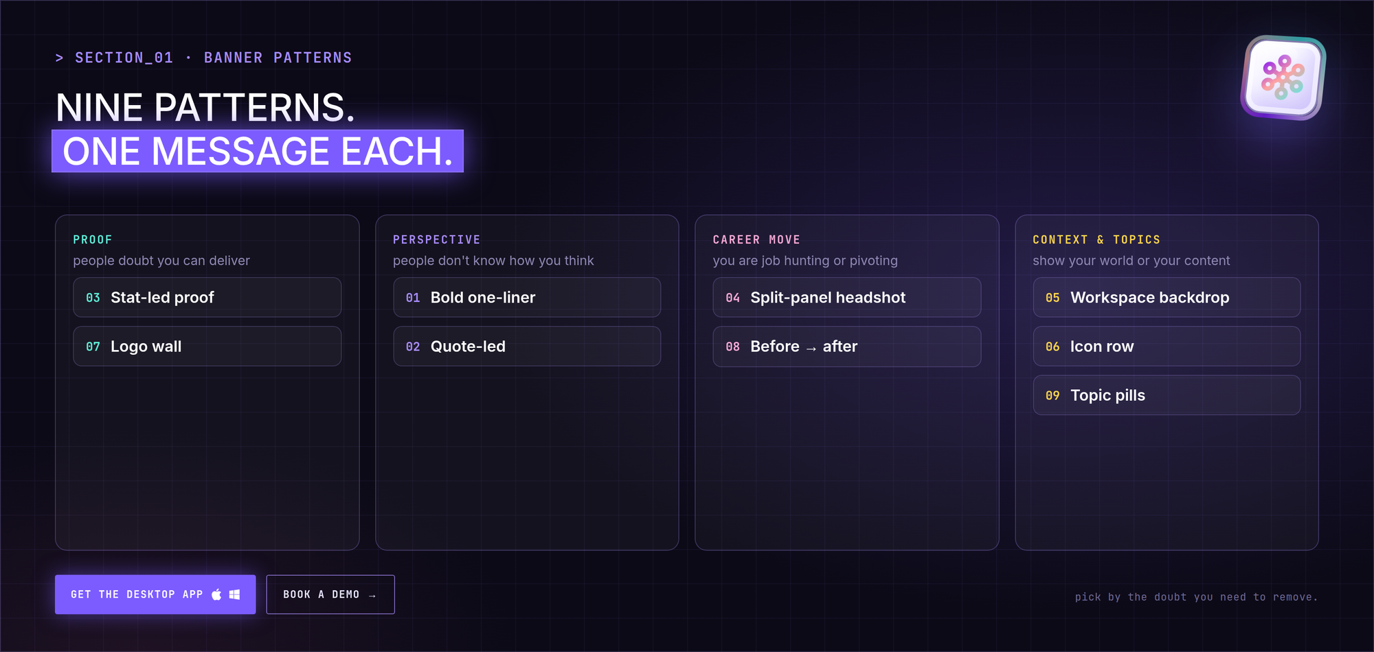
The 9 LinkedIn banner patterns
1. The bold one-line statement
A solid dark background and one large line of type. Because there is only one element, the hierarchy takes care of itself.
- Works best for: founders and anyone with a sharp, specific positioning.
- Trade-off: the line has to be strong enough to carry the whole banner. "Helping companies grow" is not. "We cut B2B onboarding from 6 weeks to 6 days" is.
- CrossLike tip: use the same line as the hook of your pinned or most recent post. When someone arrives from that post, the banner confirms they are in the right place.
2. The quote-led banner
A large serif quote on a warm background, with a small attribution line underneath. It signals what you believe rather than what you sell.
- Works best for: consultants, coaches and analysts whose opinions are the product.
- Trade-off: it needs a quote that is actually quotable. A weak line looks worse at large size.
- Where to find the line: your own posts. Look at which sentence people quoted back to you in comments. That's your banner.
3. The stat-led proof banner
One giant number with a short caption, often on a two-tone panel. Credibility at a glance.
- Works best for: recruiters, salespeople and agencies with outcomes they can count.
- Trade-off: the number must be real and defensible. Rounded honest numbers ("200+ placements") read as more believable than suspiciously precise ones.
4. The split-panel headshot
A tagline on the left and a small, second headshot on the right, placed well away from your profile photo.
- Works best for: job seekers and salespeople who want a warmer first impression than type alone.
- Trade-off: the extra face must stay small and far from the bottom-left corner, or it fights with your actual profile photo.
5. The workspace backdrop with overlay
A photo or illustration of your environment with a dark gradient overlay and a short line of text on top.
- Works best for: operations, real estate, logistics, hospitality: roles where the setting tells part of the story.
- Trade-off: the overlay has to be strong enough to keep the text readable on both desktop and mobile crops.
6. The minimalist icon row
Name and role on the left, four labelled line icons on the right, acting like a visual table of contents for your skills.
- Works best for: engineers, designers and technical specialists whose toolkit is the pitch.
- Trade-off: it tells people what you do, not why it matters. Pair it with a headline that carries the "why".
7. The logo wall
A row of client or employer logos on white chips above one positioning line.
- Works best for: consultants, agencies and freelancers whose client list is their biggest asset.
- Trade-off: every logo must be a real client or employer you're allowed to name. If you'd hesitate to explain one on a call, remove it.
8. The before–after transition
Two panels: where you were and where you're going, joined by an arrow and a color shift from left to right.
- Works best for: career changers and people making a visible pivot.
- Trade-off: it only works for one specific, named transition, not a vague aspiration.
9. The topic-pill creator banner
Your name, a small headshot, and three equally sized rounded "pills" naming the topics you post about.
- Works best for: creators and anyone building an audience, because new visitors decide whether to follow based on topics.
- Trade-off: it goes stale the moment your posting drifts beyond those three topics. Revisit it every few months.
- CrossLike tip: your weekly Content Plan in CrossLike is built around the outcome you choose. Use the same three themes for your pills, so the banner, the posts and the promise all match.
Which banner pattern fits your role
| Role | Best pattern | Why it works |
|---|---|---|
| Consultant or agency owner | Quote-led (2) or logo wall (7) | Beliefs or a client list build trust faster than a job title |
| Founder | Bold one-line statement (1) | Say what the company does in the fewest possible words |
| Recruiter | Stat-led proof (3) | One credible placement number beats describing your process |
| Job seeker | Split-panel headshot (4) or before–after (8) | A face builds trust; a named target role focuses the search |
| Creator | Topic-pill banner (9) | New followers stay when topics match what they came for |
| Salesperson or AE | Stat-led proof (3) or split-panel headshot (4) | Numbers prove outcomes; a face warms up cold outreach |
A simple rule if you are stuck: pick a proof pattern (3 or 7) if people doubt whether you can deliver, a perspective pattern (1 or 2) if they don't yet know how you think, and a career move pattern (4 or 8) if you're job hunting.
LinkedIn banner size, specs and safe zones
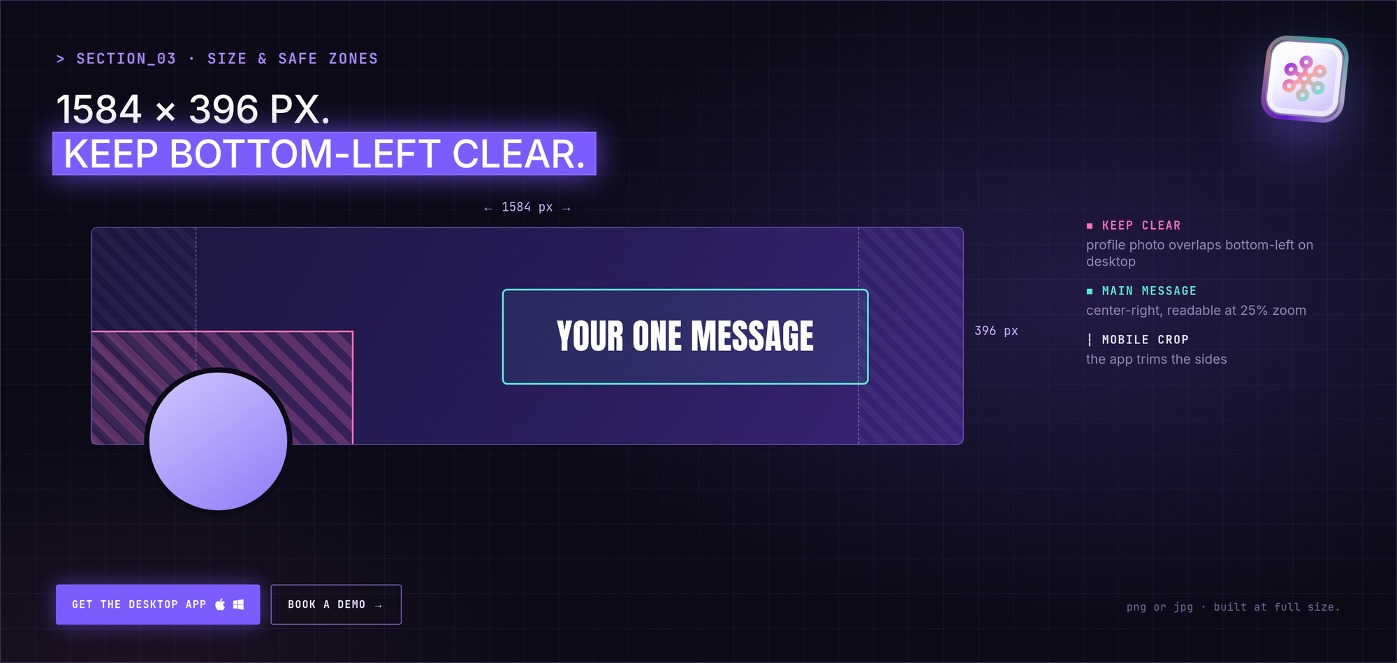
- Size: 1584 × 396 px for personal profiles (a 4:1 ratio). Design at full size instead of upscaling a smaller file.
- Format: PNG or JPG. PNG keeps text edges crisp; JPG keeps file size down for photo-heavy banners.
- The bottom-left corner: on desktop your round profile photo overlaps it. Keep text, logos and secondary faces out of that zone.
- Mobile crop: the app crops the sides and shows the banner smaller. Keep the main message in the center-right and test it on your phone before calling it done.
- Contrast: check your main line at 25% zoom. If it's hard to read small, it will be hard to read on mobile.
Where to get banner elements (without legal headaches)
- Photos and illustrations: use stock libraries that grant commercial rights. Avoid images pulled from search results where you can't confirm the license.
- Quotes: mine your own post history for your sharpest line. It's original and it's already proven that people react to it.
- Icons: take all four icons in an icon row from the same set so stroke weight and style match.
- Logos: use official logo files, and only for companies you've worked with.
Your banner only converts traffic you actually get
Here is the uncomfortable part: a perfect banner on a profile nobody visits does nothing. Profile visits on LinkedIn mostly come from activity: posts that reach beyond your first-degree network, and comments that put your name in front of new people.
That's the loop CrossLike is built around, and it runs from the CrossLike desktop app on your machine, at a pace you control:
- Boost your best posts early. Choose the mix of likes, comments, saves and DM shares from real professionals in the CrossLike community, and see the credit cost before you confirm. Early momentum helps a post reach people outside your network, and some of them click through to your profile.
- Show up in the right conversations. The Engagement Engine follows the voices your buyers already read and drafts comments from the context of each post. You approve each one by default. Good comments are one of the most reliable ways to earn profile visits from people who've never heard of you.
- Reply while threads are warm. The Reply Center surfaces every new comment on your posts with a ready-to-edit reply, so visitors see an active, responsive profile.
- Know who leaned in. Warm Leads separates organic interest from community activity and compares each engager with your ideal customer profile, so you know which new visitors are worth a follow-up.
So the banner becomes the last step of a sequence: a post or comment gets someone's attention, they click your name, and the banner tells them in one line why they should stay.
Pre-publish banner checklist
- Exported at a full 1584 × 396 px, not upscaled.
- One message only, readable in three seconds.
- Bottom-left corner clear of text, logos and faces.
- Main line readable on a phone at arm's length.
- Every number and logo can be defended on a sales call.
- The banner's message matches your headline and your last three posts.
- You've set a reminder to review it in three months.
FAQ
What makes a good LinkedIn banner?
A clear hierarchy (one dominant element), strong contrast, and one message. Each of the nine patterns above satisfies those three checks in a different way.
What should I avoid putting on my LinkedIn banner?
Anything in the bottom-left corner where your profile photo overlaps, more than one message, and any number or client logo you can't back up.
What is the LinkedIn banner size in 2026?
1584 × 396 px for personal profiles. The mobile app crops the sides, so keep your key message toward the center-right.
How do I get more people to see my banner?
Get more profile visits. On LinkedIn those come mostly from posts that travel beyond your network and comments on other people's posts. CrossLike helps with both: boosting your best posts with real community engagement and drafting context-aware comments that you approve before they go out.
How often should I update my banner?
Review it whenever your positioning, offer or content topics change, and at least once a quarter if you use the topic-pill pattern.