How We Built a Functional Web in One Day — Using Figma Sites (No Code Required)

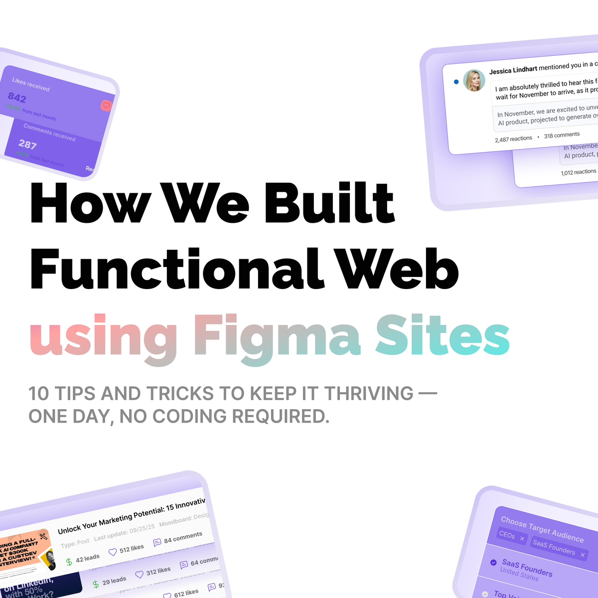
10 Tips & Tricks to Keep It Thriving

Introduction
Imagine this: in one day, no developers involved, we designed and published a working website. All inside Figma. No code. No export workflows. Just pure design → launch.
That’s exactly what we did, and in this article, I want to pull back the curtain on how we did it — and share the 10 most essential tips and tricks we learned to keep the site maintainable, flexible, and alive over time.
We believe the future of the web will be partly “handmade” — lean, expressive, and built by designers. Figma Sites (in beta) gives us a peek at that future. But to make it real, you need a strategy. Here’s ours.
What Is Figma Sites — The Tool That Made It Possible
Figma Sites is a new tool by Figma that lets designers create, prototype, and publish responsive websites straight from their Figma files — no external tools or code needed.
- It supports responsive layouts with breakpoints built-in, and multi-edit to adjust across sizes.
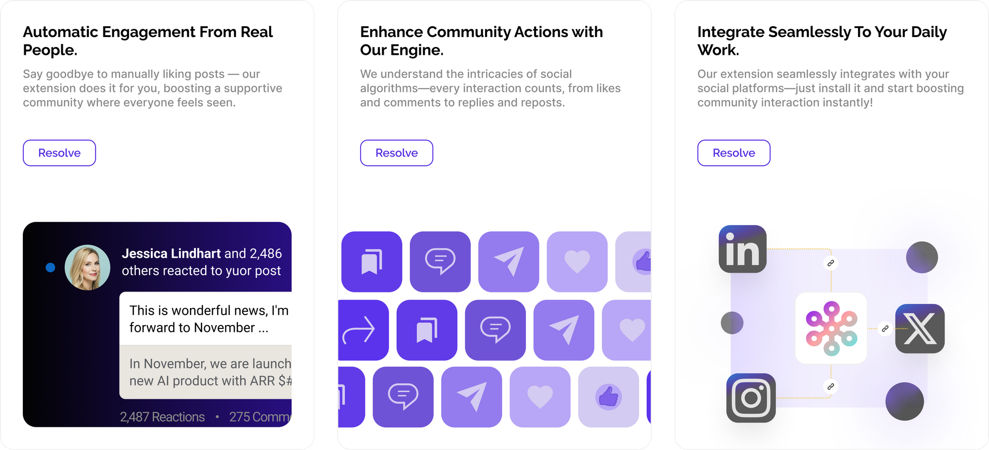
- It includes built-in interactions (parallax, marquee, lightbox, hover states, draggable, etc.).
- You can link published design libraries so your site stays consistent with your design system.
- Once published, you get a live URL; updates in Figma push changes to the site.
That said — it’s still early. As with many no-code or design-to-web tools, there are trade-offs. Some critics point out that the underlying generated code is messy, over-nested, and semantically weak — which may hurt SEO, accessibility, and long-term maintainability.
We used Figma Sites for speed and control, while being mindful of its constraints. The key was to build cleanly inside Figma and avoid pushing it beyond its limits.
Our 10 Tips & Tricks
Here are the methods we adopted to make a Figma-driven website usable, maintainable, and scalable:
- Plan your layout logic early
Before diving into frame-by-frame design, sketch (outside Figma) the core layout logic: header, hero, sections, and footers. That gives you guardrails to avoid chaotic “stacked frames” later. - Use Auto Layout religiously
Every container, every content block. Auto Layout ensures that elements remain consistent across different breakpoints. If you skip it, responsive adjustments become painful. - Define a base style scale & spacing system. Those elements remain consistent across different. Manually restyle every frame.
Choose your primary typography scale (h1, h2, body, small) and spacing increments (e.g. 8 px, 16 px, 24 px) from the start. Reuse styles—don’t manually restyle every frame. - Organize components & variants up front.
Build your design system inside Figma before building the pages: buttons, cards, nav items,and sections. Use variants to handle states (hover, active) so when you publish, interaction logic is more consistent. - Limit depth and nesting..
Deep frame nesting is the enemy. Flatten when possible. Figma Sites can handle multiple nested groups, but the more you nest, the more complex edits and debugging become. - Use built-in interactions sparingly and meaningfully.more complex
Parallax, marquee, scroll transforms — they’re fun. But only where they contribute to the experience. Overuse can slow the site or produce janky effects. - Annotate content and behavior inside Figma
Embed text notes, labels, and interaction directions (e.g. “on click, open lightbox”) to keep context with the design. This helps when revisiting later or handing off to others. - Test across breakpoints early and often.
Use Figma’s multi-edit to see how layouts respond. Preview often. Catch issues early (e.g., text overflow, unusual spacing) rather than after the full build. - Limit custom code embeds, text overflow, and unusual spacing.
Figma Sites allows you to insert code or scripts (analytics, chatbots). Use these sparingly and only when necessary. Keep the core site purely Figma-driven to maximize your control. - Versioning & rollback mindset
Always back up key design states (duplicate full pages or sections). If a change breaks things, you want a snapshot to revert to. Treat each major update as a version commit.
How We Did It — Our One-Day Workflow
Here’s a breakdown of how our 1-day build went, incorporating those tips:
| Time | Task | Focus |
|---|---|---|
| 0:00–0:30 | Sketch layout, component library | Rapid ideation, define grid & spacing system |
| 0:30–1:30 | Build components + variants | Buttons, cards, nav, hero, sections |
| 1:30–3:30 | Lay out pages | Apply Auto Layout, start placing content |
| 3:30–4:30 | Add interactions & behavior | Parallax, lightboxes, hover states |
| 4:30–5:00 | Preview & iterate | Test across breakpoints, fix layout issues |
| 5:00–5:30 | Insert code embeds & analytics | Minimal scripts only |
| 5:30–6:00 | Duplicate backups & version | Save working snapshots |
| 6:00 | Publish | Hit “Publish” in Figma Sites, get live URL |
Because everything was in Figma, updating content (text and images) after publishing was as simple as editing the design and republishing.
Limitations & Gotchas (What We Learned the Hard Way)
- Code quality is not “production level”
As critics have pointed out, the HTML/CSS code Figma generates is not clean or semantic. It’s okay for simple sites, prototypes, or marketing pages — but may falter for large-scale or SEO-heavy sites. - Performance & load size
Complex interactions or heavy images can slow down the process. Continually optimize assets and test on slower connections. - Custom logic & dynamic data
If your site requires user logins, database-driven content, or CMS features, Figma Sites may not be sufficient on its own. You’ll need to layer in headless services or embed scripts. - SEO & accessibility limitations
Because of auto-generated structure, manual fine tuning of semantic tags, alt texts, aria labels, etc. might be limited or require manual code embed. - Beta & evolving product
Figma Sites is still in open beta. Features should improve, but bugs and missing features are expected.
We accepted these trade-offs consciously: we traded perfect code for speed, maintainability, and creative control.
Keeping the Site Thriving Over Time
To make sure this Figma-built website stays alive and doesn’t degrade or become a mess later:
- Periodically audit layout logic — refactor when you spot misalignments or duplication.
- Encourage content editors to use only predefined styles and components, avoiding ad-hoc edits.
- Monitor site performance (page speed, mobile load times) and remove heavy elements when needed.
- Use analytics to track interaction elements. If some scroll or parallax tricks don’t engage, simplify.
- As Figma Sites evolves (new features, optimizations), revisit your design to leverage improvements.
Final Thoughts & Invitation
🧙♂️ Building a functional, designed website in one day — no code — felt almost magical. However, the magic lies in the discipline: effective layout planning, meticulous use of Auto Layout and components, and restraint in interactions.
✨ Figma Sites opens a gateway to a more expressive, design-led web. It’s not perfect, but if you use it wisely, it can be a powerful tool. We hope our process and tips help you build faster, stay lean, and focus on what matters: content, storytelling, and experience.
📮 Send me your thoughts: sergey@crosslike.club